
HeadHodge
Bula To Eternity
My friends call me 'Hedgie'. No need for formalities here.It woiks! That's awesome, thanks Hedge!
My friends call me 'Hedgie'. No need for formalities here.It woiks! That's awesome, thanks Hedge!
I was just hedging my bets, Mr. Hedgie.My friends call me 'Hedgie'. No need for formalities here.


") I don't see any errors in console, looks like it's working good. I only have two suggestions at the moment, not sure if these are possible or not:
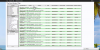
I don't see any errors in console, looks like it's working good. I only have two suggestions at the moment, not sure if these are possible or not:You can sort by a particular column (e.g. "Heady") by dragging and dropping the column header to the left-most position:- Is there a way to make the columns sortable by the header of the column? For instance, if I search for micronized, but I want to see the headier ones on top, it would be nice to be able to click the column title of that particular rating and have the table re-sort by highest to lowest. There are a number of jquery plugins that do this, but they usually require that you use dd's and dt's for layout instead of divs. Not sure if the way you built this allows for that or not... Just thought it would be a nice feature.
Aaaah cool!You can sort by a particular column (e.g. "Heady") by dragging and dropping the column header to the left-most position:
New Review Tool
Thanks for your feedback. I'm dying to know to know if my changes helped make the iPhone layout any better or not (than from your original report of it being ragged looking). You might have answered already, but wasn't clear to me if it's better or not.Aaaah cool!
Great point. I've added that to my todo list.....I noticed I couldn't get back to the main instructions once I had made a search. I'd suggest making a little link on the bottom somewhere that pops up the instructions in case people get lost or want to view them again without having to refresh the page......
You really blew my setup.Hoo th' fuck is Ray?
Ray is fucking a HooYou really blew my setup.
You were supposed to ask: Hoo is fucking Ray??

Wow thanks!!! Just when I almost give up, you come through like gangbusters.it's fairly usable in the sideways view because you can can see more of the words in the left panel.
upright doesn't show all the words/choices, so you wouldn't know what you're choosing.
these days most websites build the html for both a computer and separately for mobile devices.
the page checks what device you're using and displays the appropriate page.
i'm not sure if you're using Dreamweaver and I don't know what you have control over on your end, I haven't done html since Adobe GoLive 4 (a long time ago), but I'd suggest doubling the visible size of the left panel and making the right panel thinner on the 'mobile' version.
I think iphone emulators might exist that allow you to view it on your computer, what it would look like on an iphone.
...and i think current html editor software lets you create height x width views that are in ratio with mobile devices to let you see what it will look like on them
So where do farts go to retire? But seriously, very nice tool, thanks for the work you put into it.Wow thanks!!! Just when I almost give up, you come through like gangbusters.
I'm an old retired fart, so of course I still write everything in binary code. But I will prove (someday) that you can teach old dogs new tricks.
Sacramento in the summertime. That's why it smells so bad here.So where do farts go to retire? But seriously, very nice tool, thanks for the work you put into it.
What is this 'html' thingy that everyone is talking about? Is it a yoga position or something?.... I haven't done html since Adobe GoLive 4 (a long time ago), ....
What is this 'html' thingy that everyone is talking about? Is it a yoga position or something?

Yeah, I live in an agricultural area... we get "agricultural" smells in the summer... it's invigoratingSacramento in the summertime. That's why it smells so bad here.
Thanks.... Supporting multiple themes is on my todo list. How to do that is still a mystery to me, but I'm working on it.on computer:
View attachment 3618
works for both
i don't know if you have control over the font color or if it's dictated by my 'forum theme', but the left panel text could be darkened.